Step by Step Infographic Icons Set Guide
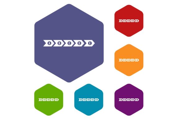
Visualizing a process is often more challenging than executing it. Whether you are mapping out a customer journey, explaining a technical workflow, or designing an educational curriculum, the clarity of your presentation determines its success. The Step by Step Infographic Icons Set offers a structured visual language designed specifically for these sequential narratives. Featuring distinct rhombus shapes in varied colors against a clean white background, this collection moves beyond generic clip art to provide a cohesive system for professional communication.
The choice of the rhombus shape is intentional. Unlike circles, which can imply endless cycles, or squares, which suggest static stability, the diamond orientation implies direction and progression. It naturally guides the viewer’s eye from one point to the next, reinforcing the concept of movement and development. When isolated on a white background, these icons become versatile building blocks that adapt seamlessly to any brand identity or layout requirement without visual friction.
Leveraging Multi-Format Flexibility in Design Workflows
Professional design requires assets that survive the transition from concept to final production. This icon set supports a comprehensive range of file formats including JPG, EPS, AI, PSD, and PNG, ensuring compatibility across different stages of the creative pipeline. Understanding when to use each format is essential for maintaining quality and efficiency.
- AI and EPS: These vector-based formats are the source of truth for designers. They allow for infinite scaling without pixelation, making them ideal for large-format printing like trade show banners or office wall graphics. More importantly, they enable color manipulation. If your brand guidelines specify a particular shade of teal rather than the default palette provided, the AI file allows you to adjust global swatches instantly while retaining crisp edges.
- PSD: For marketers and social media managers working within the Adobe ecosystem, the layered PSD file offers non-destructive editing capabilities. You can toggle visibility, add layer styles like drop shadows or glows, and integrate the rhombus icons directly into complex compositions without leaving Photoshop. This format bridges the gap between pure illustration and photo-compositing.
- PNG: The transparent PNG is the workhorse for digital content. Because these icons are isolated on white in the source files, having a pre-cut transparent version saves significant time for web designers and bloggers. These are perfect for overlaying on colored sections of a website, embedding in email newsletters, or placing over video thumbnails where a white bounding box would look unprofessional.
- JPG: While less flexible for editing, high-resolution JPGs serve as quick reference points for mood boards, client presentations, or internal documentation where file size and universal accessibility matter more than editability.
Strategic Color Coding for Sequential Logic
The inclusion of different colors within the set is not merely aesthetic; it is a functional tool for information architecture. In step-by-step visualization, color acts as a secondary data channel. You can utilize the varied hues to represent different departments involved in a workflow, distinct phases of a project timeline, or varying levels of priority.
For example, an HR manager creating an onboarding infographic might assign blue rhombuses to administrative tasks, green to training modules, and orange to social integration activities. This chromatic coding allows new employees to scan the document and understand the nature of their first week at a glance. Conversely, a software developer documenting an API integration might use a monochromatic gradient of the same color to indicate deepening complexity or dependency chains. The key is consistency; once you establish a color logic, apply it rigorously throughout the entire presentation to reduce cognitive load for your audience.
Adapting Rhombus Icons Across Industries and Platforms
The geometric neutrality of the rhombus makes this Step by Step Infographic Icons Set uniquely adaptable across diverse sectors. It avoids the playful connotations of rounded cartoons and the rigid austerity of technical schematics, striking a balance that suits modern business communication.
Educators and Trainers can transform abstract learning objectives into tangible milestones. Instead of a bulleted list of course outcomes, arrange the rhombus icons horizontally to create a "learning path" visual. Each icon can anchor a specific module, with connecting lines suggesting the flow of knowledge. This approach helps adult learners visualize their progress and reduces the intimidation factor of dense syllabi.
Marketers and Content Creators face the challenge of stopping the scroll. In social media carousels or blog headers, a sequence of colorful diamonds creates immediate pattern recognition. Use the icons to break down complex topics like "5 Steps to SEO Mastery" or "How Our Service Works." The isolation on white ensures they pop against both light and dark mode interfaces, maintaining legibility regardless of user preference settings.
Entrepreneurs and Pitch Deck Designers often need to explain business models quickly. Investors skim decks rapidly; a wall of text will lose their attention. A horizontal procession of rhombus icons can illustrate a value chain or product development cycle more effectively than paragraphs. The forward-leaning geometry subconsciously reinforces momentum and growth, aligning the visual form with the narrative of business advancement.
Maintaining Visual Hierarchy and Clarity
Having access to a rich icon set does not guarantee effective design. Overuse is a common pitfall. To keep your infographics clear and audience-friendly, treat these icons as structural elements rather than decoration. Every rhombus should earn its place by representing a distinct, necessary step in the process.
Consider the negative space around each icon. Because they are isolated on white, they require breathing room to function properly. Crowding them together diminishes their impact and creates visual noise. Establish a consistent grid system where each icon occupies equal visual weight. If accompanying text varies significantly in length, align the icons to a baseline or center axis to maintain rhythm.
Typography pairing also plays a crucial role. The sharp angles of the rhombus pair well with clean sans-serif typefaces that share similar geometric DNA. Avoid overly ornate scripts or heavy slab serifs that might compete with the iconography. The text should support the icon, not fight it. Use the icon as the headline anchor and the text as the explanatory detail, allowing viewers to navigate the content through visual cues before diving into specifics.
Creative Variations and Customization Approaches
While the set provides a complete solution out of the box, true creativity emerges when you adapt the assets to specific contextual needs. The vector nature of the AI and EPS files invites modification that goes beyond simple recoloring.
Consider experimenting with opacity and blending modes. Layering semi-transparent rhombuses can suggest overlapping processes or parallel workflows, adding depth to flat designs. Alternatively, using the icons as masks for photography can create a compelling fusion of abstract structure and real-world imagery, particularly effective for travel itineraries or manufacturing processes where showing the actual environment matters.
You might also explore scale variation to indicate importance. While uniform sizing suggests equal steps, enlarging a specific rhombus can highlight a critical milestone or decision point. Just ensure that such deviations are meaningful and explained within the context of the graphic. Random size changes confuse readers; intentional hierarchy guides them.
For digital-first projects, think about interaction. The distinct shape of the rhombus makes it an excellent target for clickable navigation elements in interactive PDFs or web apps. Users intuitively recognize geometric shapes as buttons when styled appropriately. By leveraging the PNG transparency and adding hover states in CSS, you can turn a static infographic into an exploratory interface where users click each step to reveal detailed content.
Ensuring Accessibility and Universal Understanding
Creativity must never compromise accessibility. When using colored rhombus icons to convey meaning, always provide redundant coding. Never rely solely on color to distinguish steps, as this excludes users with color vision deficiencies. Pair each colored icon with a number, letter, or unique symbol inside the shape. This dual-coding approach ensures that the sequence remains intelligible even when printed in grayscale or viewed by someone who cannot distinguish red from green.
Alt text descriptions for web implementations should be descriptive of the step represented, not just the visual appearance. Instead of "blue rhombus icon," use "Step 3: Quality Assurance Testing." This practice aligns with WCAG guidelines and improves SEO by providing semantic context to search engines. Remember that helpful content serves all users equally; the goal is understanding, not just aesthetic appeal.
Ultimately, the Step by Step Infographic Icons Set is a toolkit for reducing friction in communication. Whether you are a freelancer pitching a new retainer model or a teacher explaining photosynthesis, these assets provide the visual scaffolding needed to make complex sequences accessible. By respecting the format strengths, applying thoughtful color logic, and prioritizing clarity over decoration, you transform simple geometric shapes into powerful instruments of understanding. The best infographics do not just display information; they facilitate comprehension, and that begins with choosing the right visual vocabulary for your message.